##############################
##          IMPORTS         ##
##############################
# Need to import and format the data, create
# box plots, correlation matrix, contingency tables
import pandas as pd
# needed to create pie charts
import matplotlib.pyplot as plt
# Need for chi-squared test
import scipyPython Homework 2: Example Solutions
These are example solutions to the third Python homework, involving performing data analysis on the titanic data set. Other correction solutions and implementations are possible.
##############################
##   IMPORT THE DATA FILE   ##
##############################
titanic_data = pd.read_csv("../DataSets/titanic_train.csv")
##############################
## DESCRIBE ##
##############################
# Use the describe function to print a statistical
# summary of the numeric data.
titanic_data.describe()| PassengerId | Survived | Pclass | Age | SibSp | Parch | Fare | |
|---|---|---|---|---|---|---|---|
| count | 891.000000 | 891.000000 | 891.000000 | 714.000000 | 891.000000 | 891.000000 | 891.000000 |
| mean | 446.000000 | 0.383838 | 2.308642 | 29.699118 | 0.523008 | 0.381594 | 32.204208 |
| std | 257.353842 | 0.486592 | 0.836071 | 14.526497 | 1.102743 | 0.806057 | 49.693429 |
| min | 1.000000 | 0.000000 | 1.000000 | 0.420000 | 0.000000 | 0.000000 | 0.000000 |
| 25% | 223.500000 | 0.000000 | 2.000000 | 20.125000 | 0.000000 | 0.000000 | 7.910400 |
| 50% | 446.000000 | 0.000000 | 3.000000 | 28.000000 | 0.000000 | 0.000000 | 14.454200 |
| 75% | 668.500000 | 1.000000 | 3.000000 | 38.000000 | 1.000000 | 0.000000 | 31.000000 |
| max | 891.000000 | 1.000000 | 3.000000 | 80.000000 | 8.000000 | 6.000000 | 512.329200 |
##############################
##    BOX PLOT: SURVIVED    ##
##############################
# Use the Pandas Dataframe boxplot function
titanic_data.boxplot("Survived")
plt.show()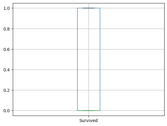
##############################
##     BOX PLOT: PCLASS     ##
##############################
# Use the Pandas Dataframe boxplot function
titanic_data.boxplot("Pclass")
plt.show()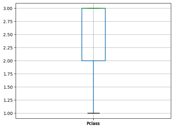
##############################
##       BOX PLOT: AGE      ##
##############################
# Use the Pandas Dataframe boxplot function
titanic_data.boxplot("Age")
plt.show()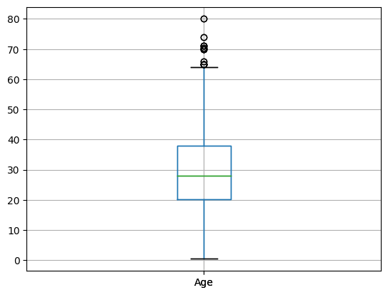
##############################
##      BOX PLOT: SIBSP     ##
##############################
# Use the Pandas Dataframe boxplot function
titanic_data.boxplot("SibSp")
plt.show()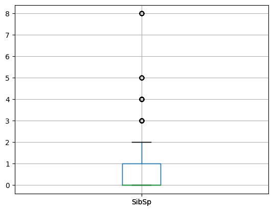
##############################
##      BOX PLOT: PARCH     ##
##############################
# Use the Pandas Dataframe boxplot function
titanic_data.boxplot("Parch")
plt.show()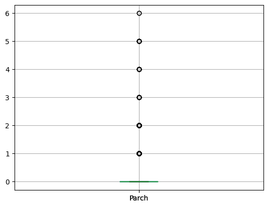
##############################
##      BOX PLOT: FARE      ##
##############################
# Use the Pandas Dataframe boxplot function
titanic_data.boxplot("Fare")
plt.show()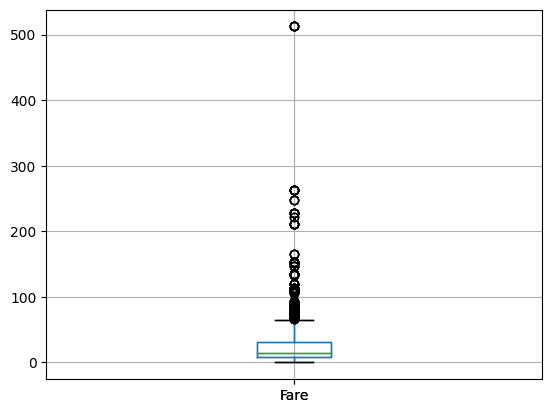
##############################
##           INFO           ##
##############################
# Use the info function to determine which columns
# are categorical (object data type). Name and Cabin
# have too many individual values to make a good pie chart.
titanic_data.info()
<class 'pandas.core.frame.DataFrame'>
RangeIndex: 891 entries, 0 to 890
Data columns (total 12 columns):
# Column Non-Null Count Dtype
--- ------ -------------- -----
0 PassengerId 891 non-null int64
1 Survived 891 non-null int64
2 Pclass 891 non-null int64
3 Name 891 non-null object
4 Sex 891 non-null object
5 Age 714 non-null float64
6 SibSp 891 non-null int64
7 Parch 891 non-null int64
8 Ticket 891 non-null object
9 Fare 891 non-null float64
10 Cabin 204 non-null object
11 Embarked 889 non-null object
dtypes: float64(2), int64(5), object(5)
memory usage: 83.7+ KB##############################
## PIE CHART: SEX ##
##############################
# Use value counts to format the column of data
sex_counts = titanic_data["Sex"].value_counts()
# Create the pie chart with labels for the different slices, add a title, and
# show the graph
plt.pie(sex_counts, labels=sex_counts.index)
plt.title("Sex of Titanic Passengers")
plt.show()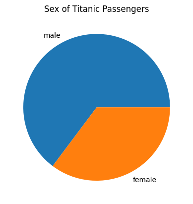
##############################
##   PIE CHART: EMBARKED    ##
##############################
# Use value counts to format the column of data
embarked_counts = titanic_data["Embarked"].value_counts()
# Create the pie chart with labels for the different slices, add a title, and
# show the graph
plt.pie(embarked_counts, labels=["Southampton", "Cherbourg", "Queenstown"])
plt.title("Port of Embarkation for Passengers on the Titanic")
plt.show()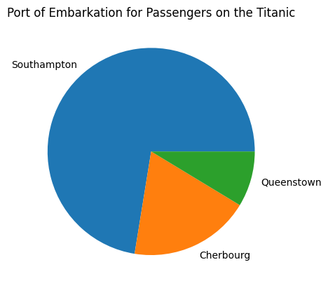
############################################
##           CORRELATION MATRIX           ##
############################################
# Create the correlation matrix with only the columns of numeric
# data and then display it
corr_matrix = titanic_data.corr(numeric_only=True)
corr_matrix
# Largest negative correlation is -0.55 which is between Pclass and Fare
# Largest positive correlation is 0.41 and is between SibSp and Parch| PassengerId | Survived | Pclass | Age | SibSp | Parch | Fare | |
|---|---|---|---|---|---|---|---|
| PassengerId | 1.000000 | -0.005007 | -0.035144 | 0.036847 | -0.057527 | -0.001652 | 0.012658 |
| Survived | -0.005007 | 1.000000 | -0.338481 | -0.077221 | -0.035322 | 0.081629 | 0.257307 |
| Pclass | -0.035144 | -0.338481 | 1.000000 | -0.369226 | 0.083081 | 0.018443 | -0.549500 |
| Age | 0.036847 | -0.077221 | -0.369226 | 1.000000 | -0.308247 | -0.189119 | 0.096067 |
| SibSp | -0.057527 | -0.035322 | 0.083081 | -0.308247 | 1.000000 | 0.414838 | 0.159651 |
| Parch | -0.001652 | 0.081629 | 0.018443 | -0.189119 | 0.414838 | 1.000000 | 0.216225 |
| Fare | 0.012658 | 0.257307 | -0.549500 | 0.096067 | 0.159651 | 0.216225 | 1.000000 |
############################################
## CONTINGENCY TABLE AND CHI SQUARED TEST ##
###########################################
# Create the contingency table with the two relavent columns of
# categorical data
cont_table = pd.crosstab(titanic_data["Sex"], titanic_data["Embarked"])
#Perform the chi-squated test and print the p value
p = scipy.stats.chi2_contingency(cont_table).pvalue
print(p)

# Since p < 0.05 the Sex of the titanic passengers and the port of embarkation
# are not independent variables
0.0012585245232290144